
FRENCH HOUSE UPDATE : THE KITCHEN
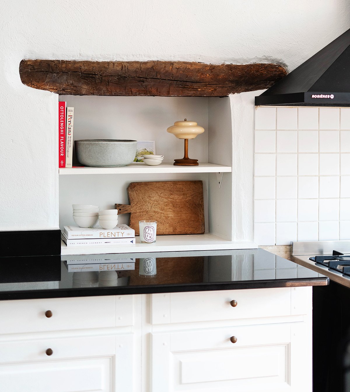
Ahh, the kitchen. I thought the kitchen was in need of a total overhaul from year one. And yet…and yet…renovating a kitchen is not for the faint hearted - especially when you live afar. The decisions you make with a kitchen regarding layout, storage, bench space, white goods etc, are all meaningful and very difficult to unwind if you get them wrong. There’s no fudging bad kitchen decisions - you just have to live with them forever more. And my goodness are they costly. So you can imagine my reluctance to tackle this room, despite it being central to the house (practically, figuratively and emotionally) and in a state that I found utterly frustrating. So here we are - year 5 of owning this house and I finally decided to ditch the kitchen renovation that I had been tinkering with for the past two years and instead give it a very simple, cost effective glow up. That way I would have a nicer kitchen at a fraction of the price with no pressure to get major decisions right.
Why Glow Up and Not Full Renovate?
Primarily because I couldn’t get comfortable with the cost of a full kitchen renovation for a holiday home that we only use once a year. Coupled with the fact that all of the kitchen designs that I had been working on were basically going to give me the exact same kitchen - just with finishes and fittings that were nicer and more my style. It was actually proving to be a tricky room to change in terms of layout and storage and so the cost (on so many levels) felt completely impossible to justify.
What Needed to be Changed?
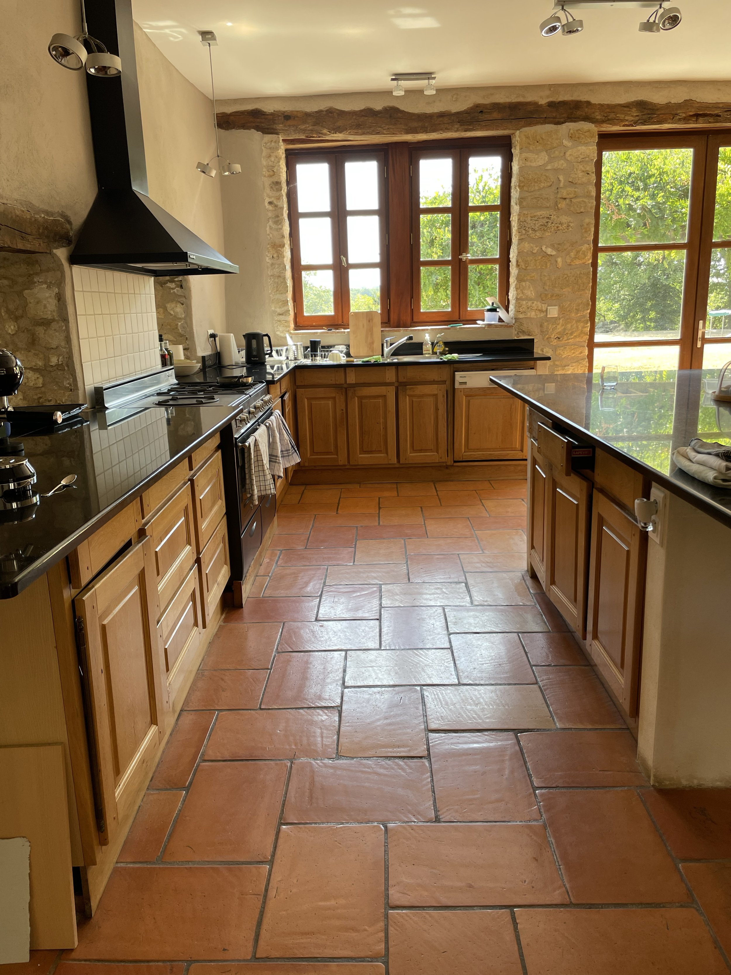
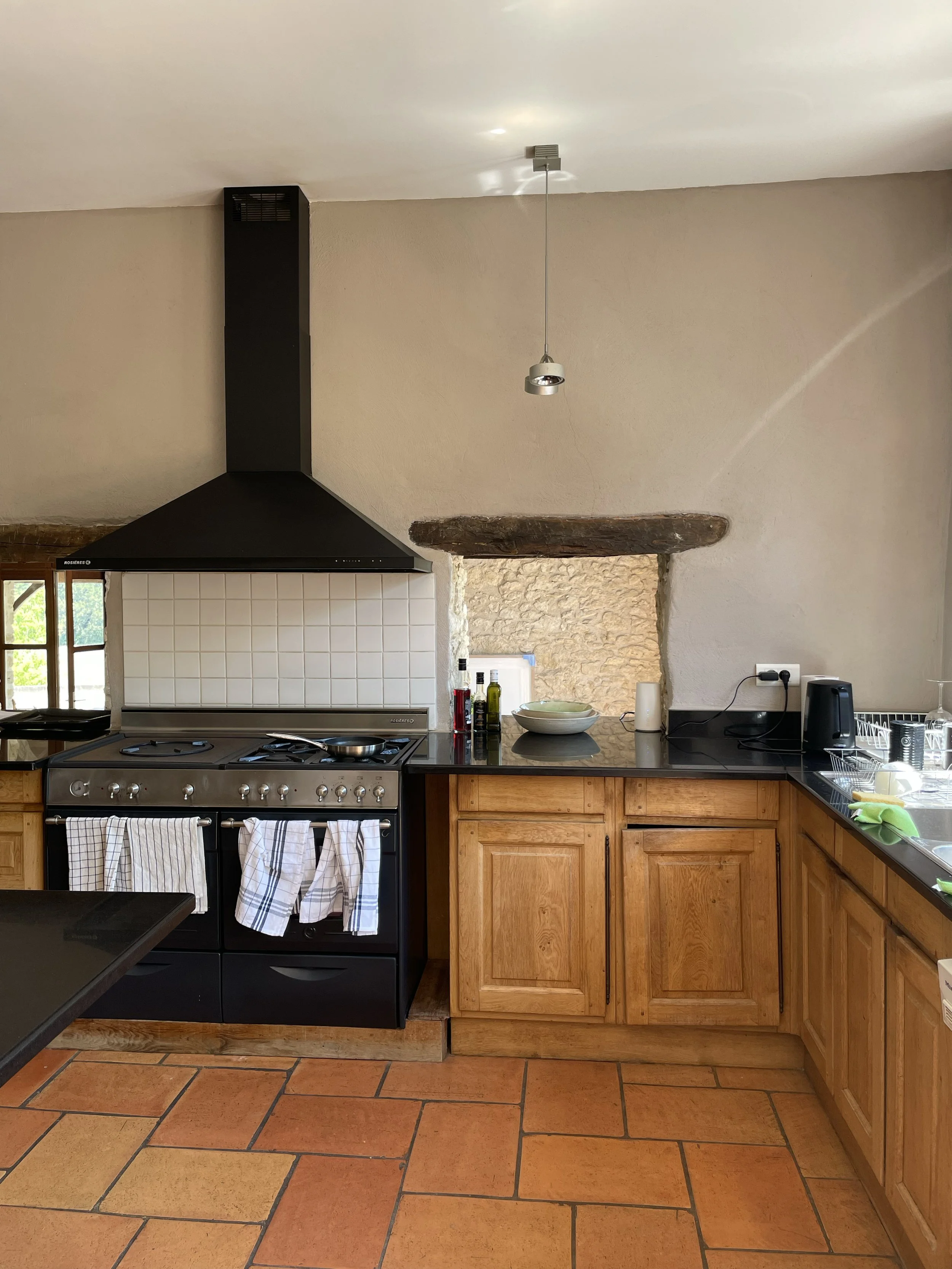
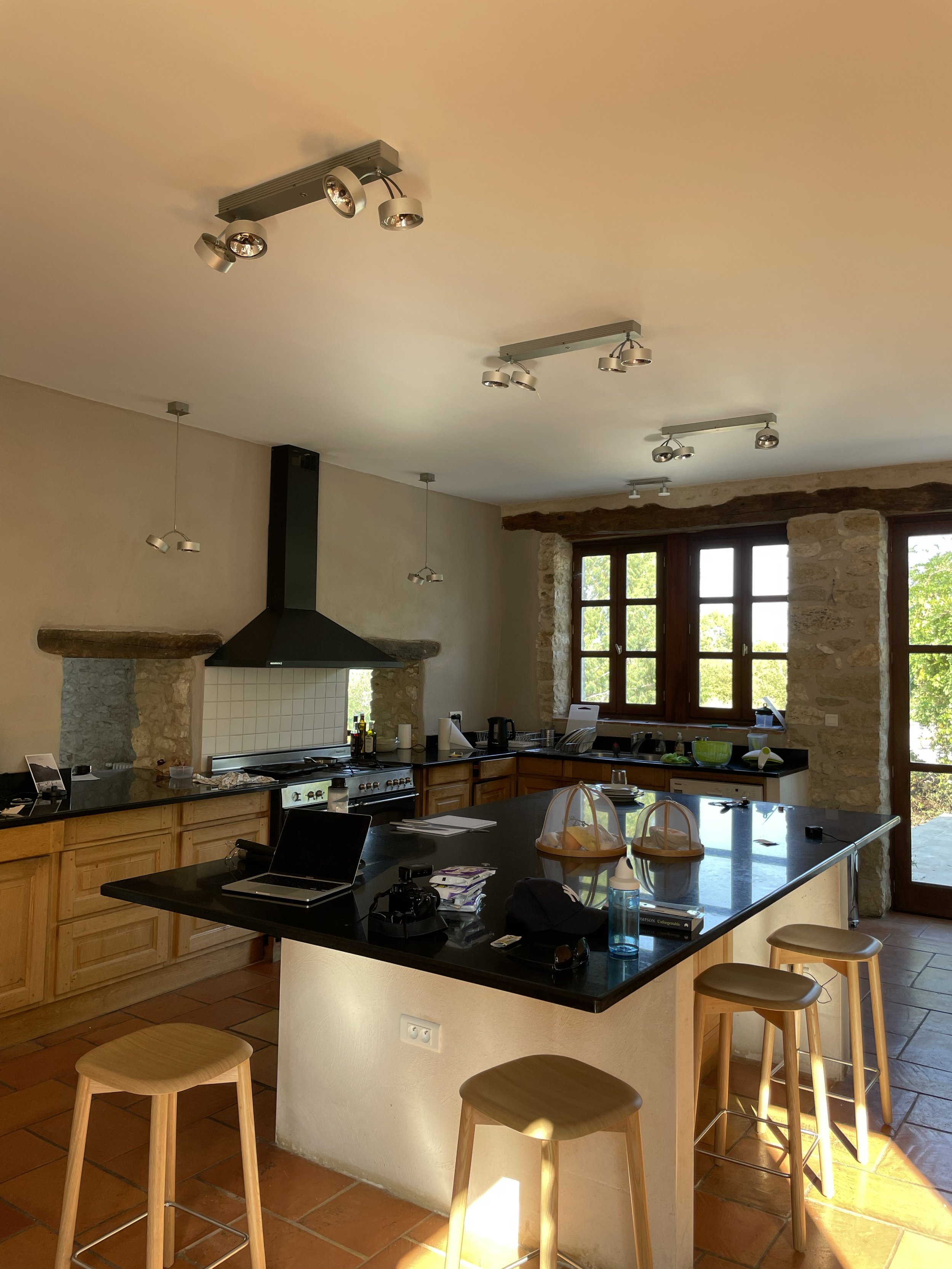
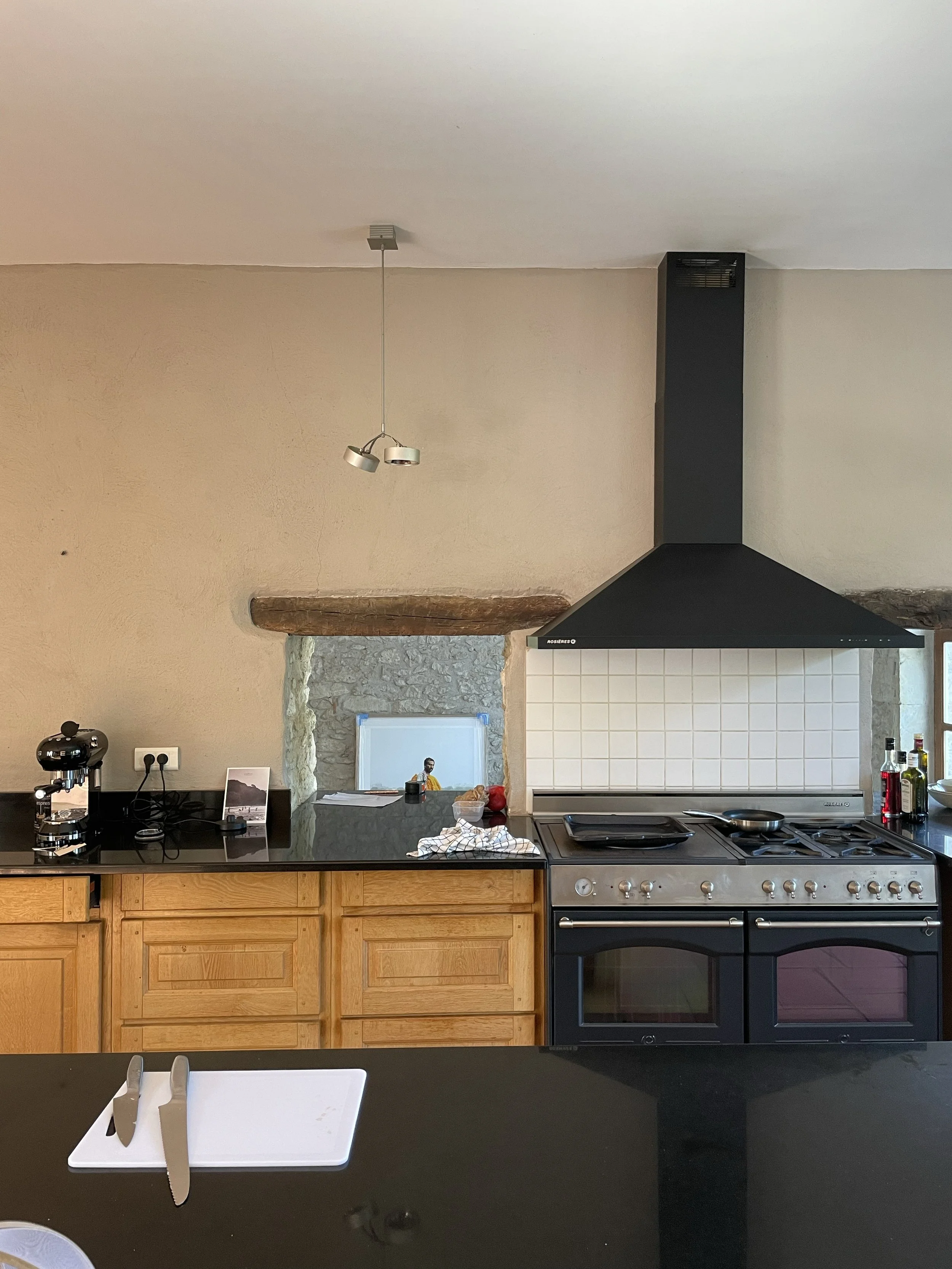
When we bought the house the kitchen was very…orangey brown. All of the timber in the house was stained a darkish brown (head to this post to see the very first decisions I made in year one with regards to paint colours and house-wide changes to lighten and brighten the home) and the previous owners had chosen an orangey stain for the timber cabinetry. They had also decided (no idea why) to not have any handles or drawer pulls on the cabinetry. Very strange. And then we have the shiny black granite bench top and a stone wall that was rough rendered in a kind of mushroom brown. Yikes.
On top of these questionable finishes, the kitchen sits in what was the original barn - and so between what is now the living room and the kitchen, sat two doorways from the days when it was a barn (you can see the timber lintels in the kitchen where these were). The previous owners renovated the building from a barn and farmhouse to one harmonious home - and so it was their decision to fill in the bottom half of these doorways on the living room side and leave two open ‘windows’ at the top - so that from the kitchen, you could look down into the living room. It was a super strange decision. So these needed to be tackled too. (To see what I did with these doorways in the living room, see this post here).
the old kitchen
Glow Up Decisions
Here is what I decided to do:
Paint the cabinetry - the quality and condition of the timber drawer and door fronts were OK (not great, but with a lick of paint they would be infinitely better)
Paint the rough rendered stone wall - I originally wanted this smooth rendered but there were complications, so it got a simple lick of paint instead
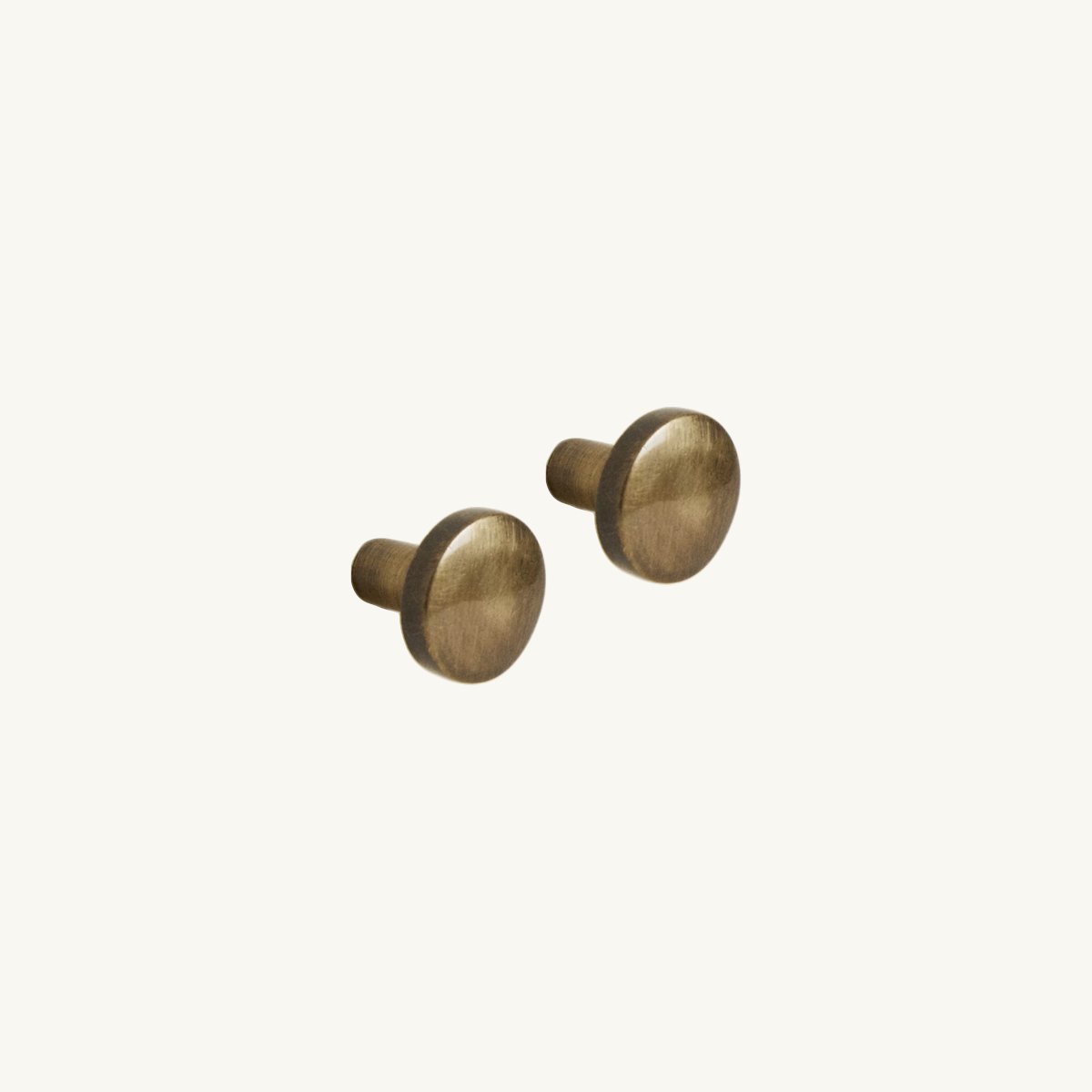
Install door and drawer pulls - the simplest of improvements but honestly (from a practical but also visual point of view) a game changer
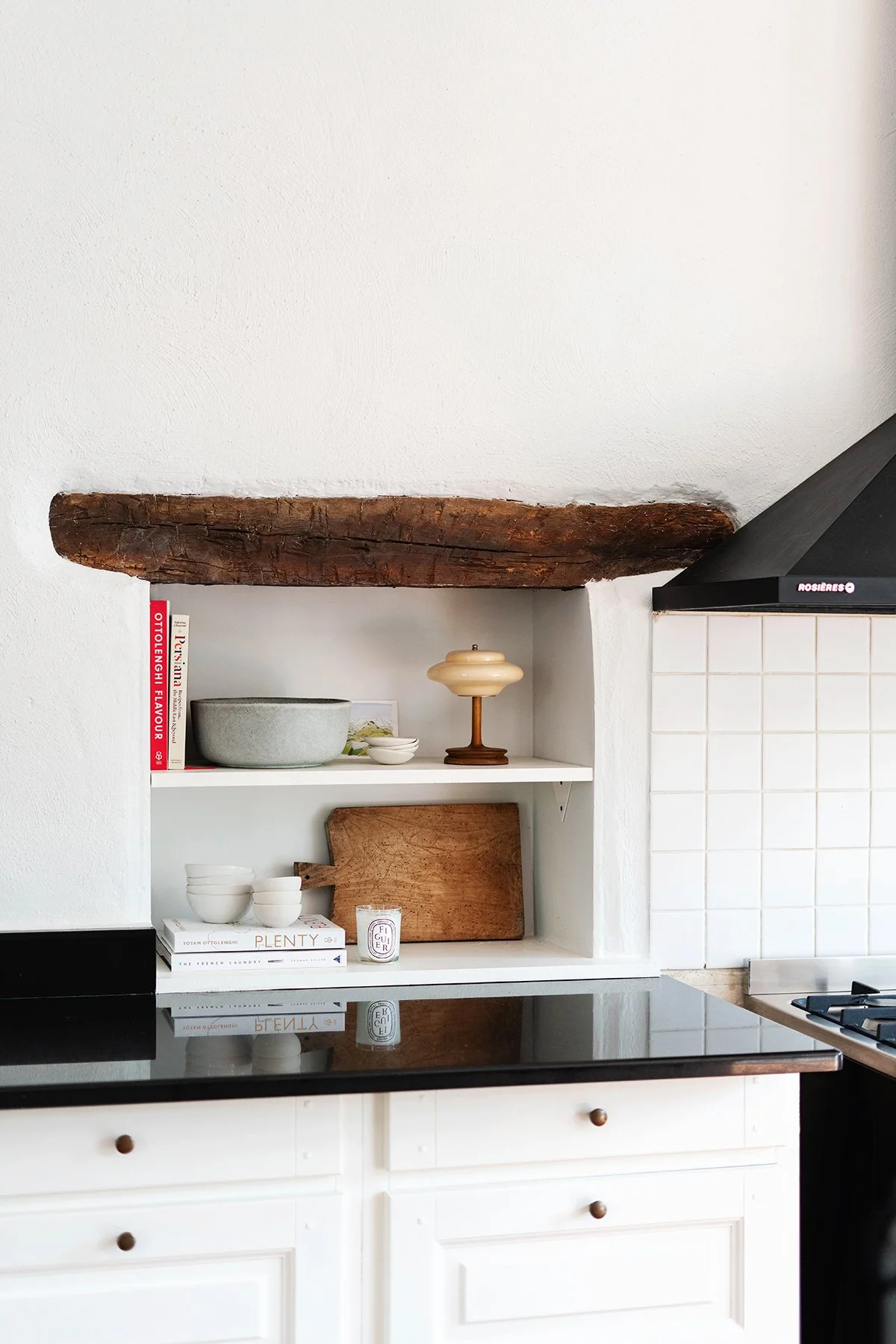
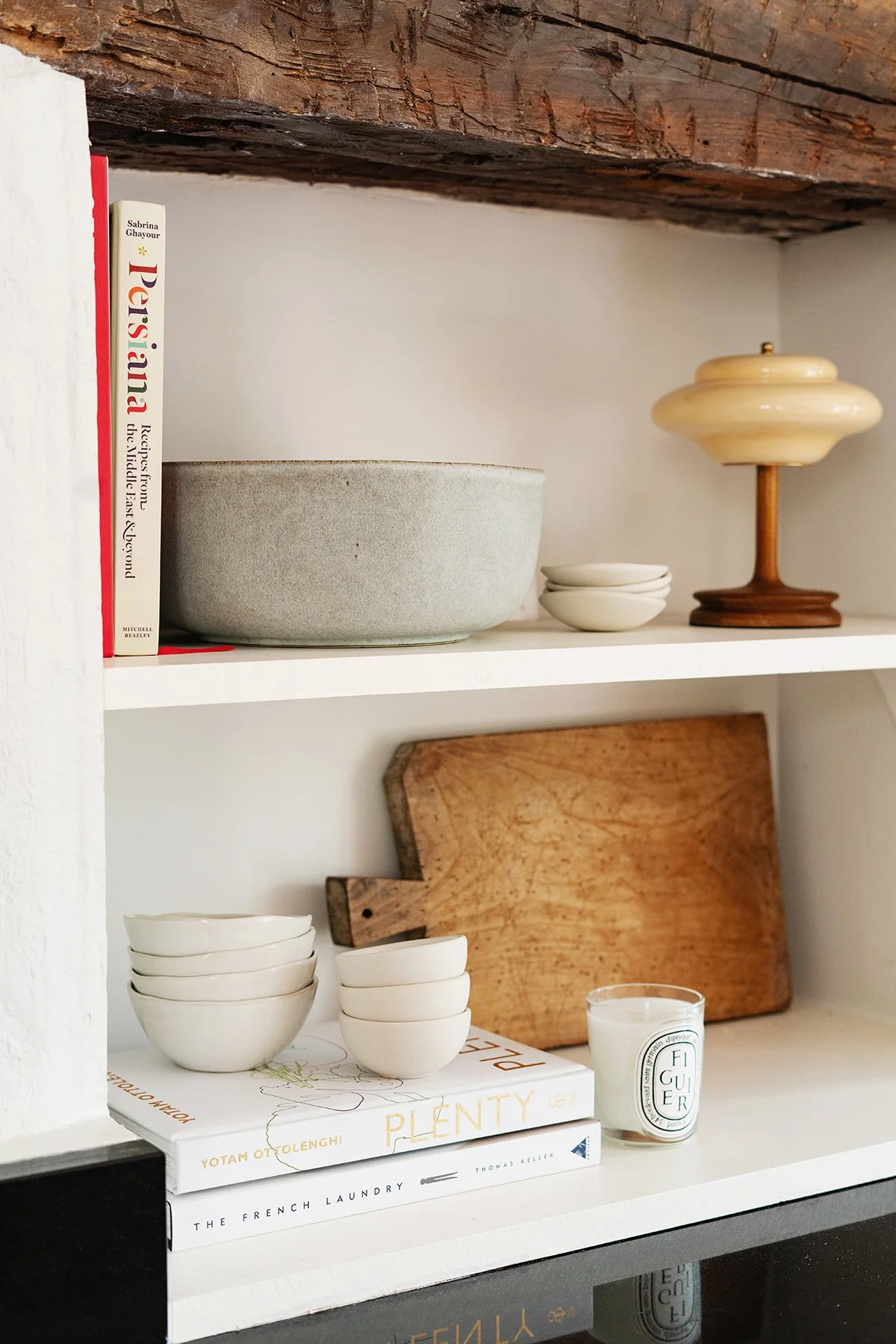
Fill in the open wall niches and create a shelf for displaying objects - an easy upgrade
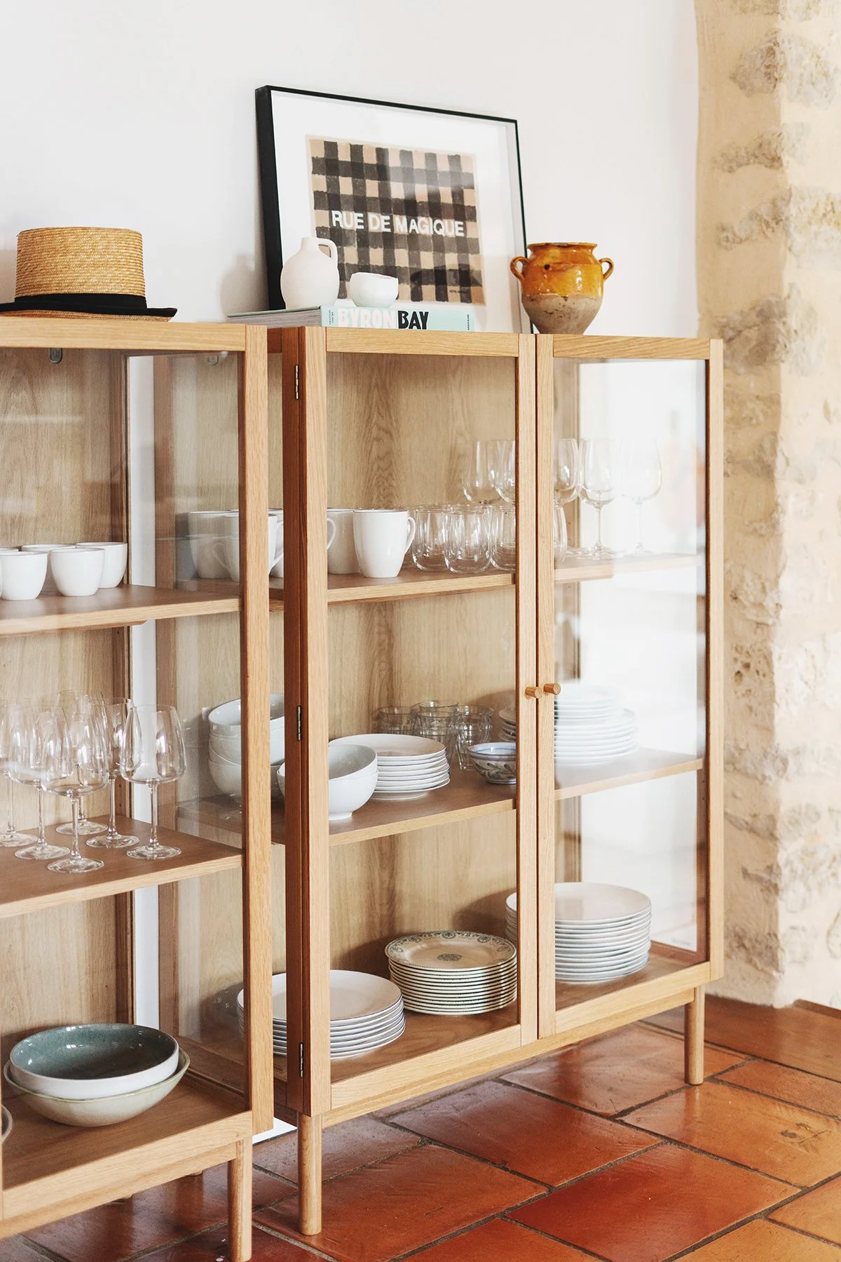
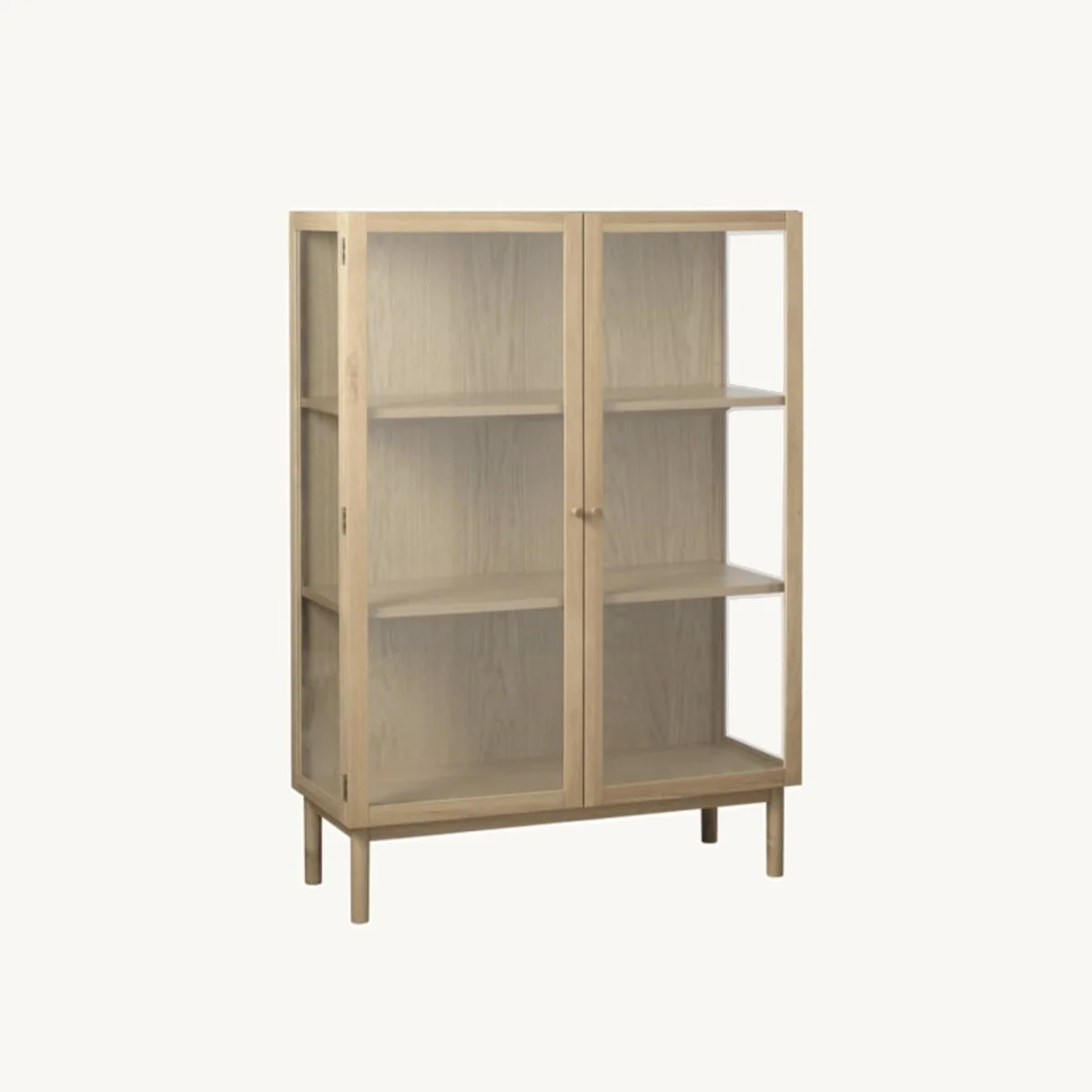
Add some freestanding storage - despite being a generous sized kitchen, there was not enough storage so I needed to add some in
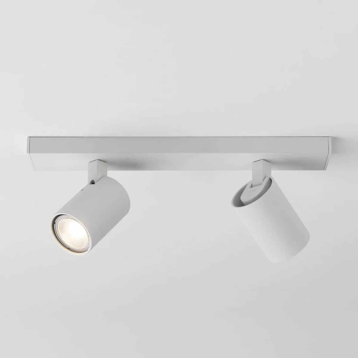
Change the lighting - the original lighting was both not really working and was really dated and ugly - so this needed to change
Install a new sink and tap - the original stainless steel double sink and tap was fine but was just old and with brass drawer knobs I decided to not mix metals
The Results
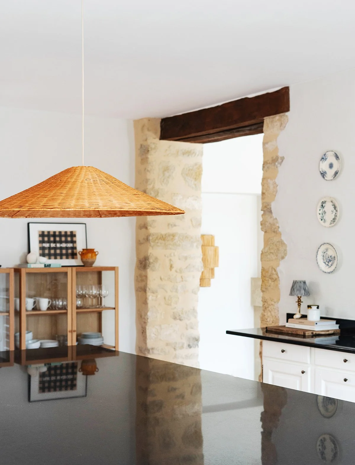
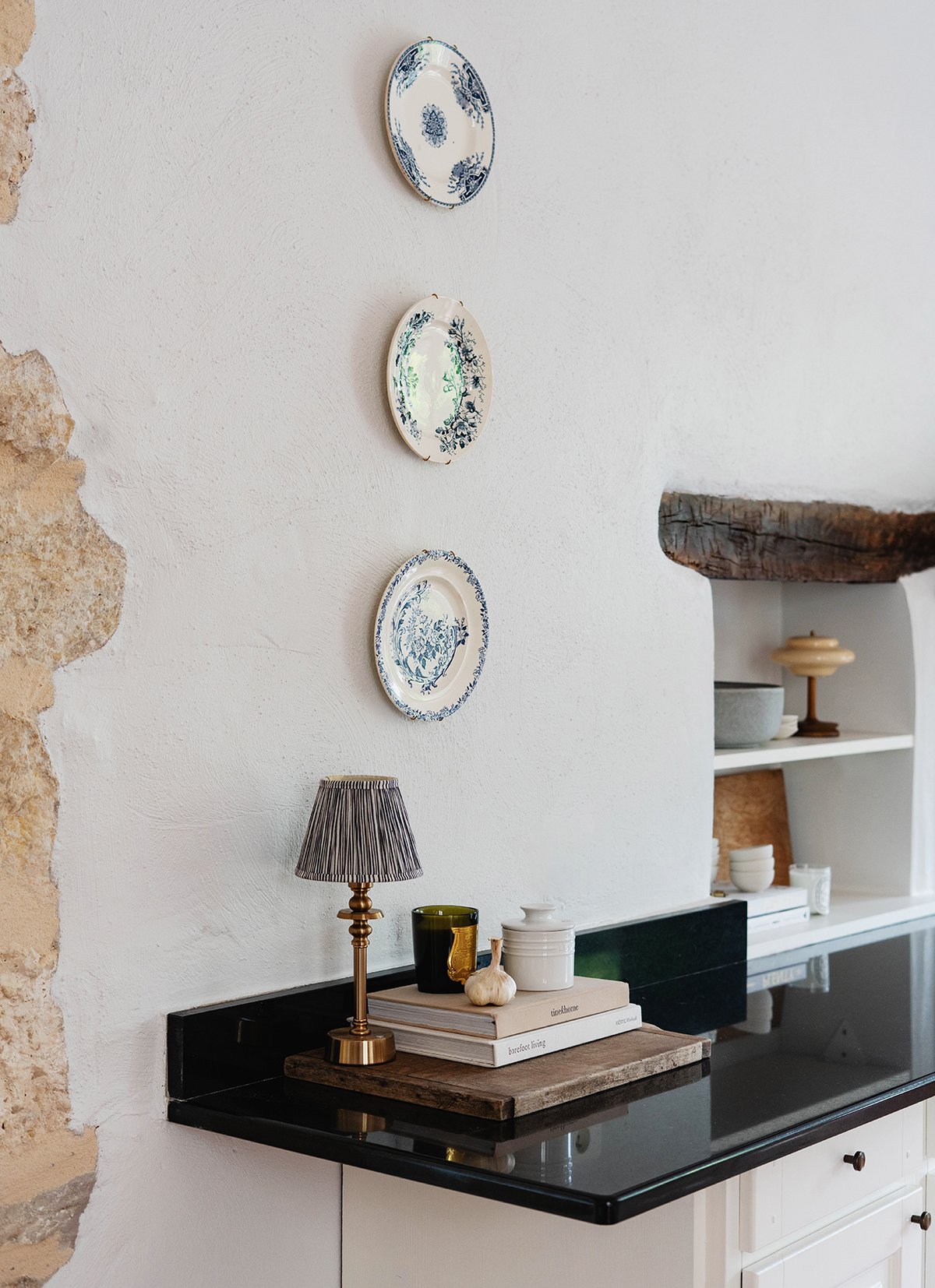
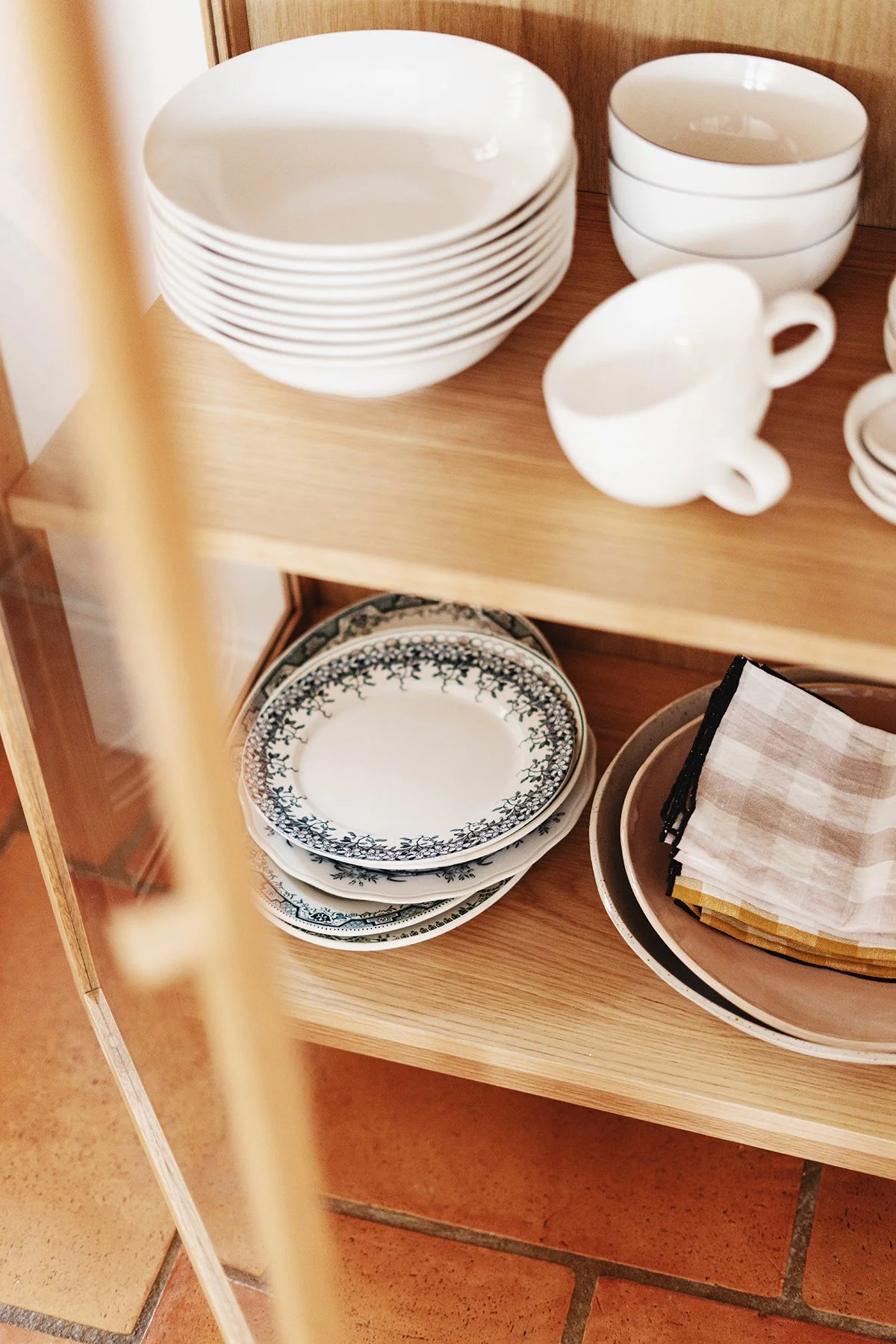
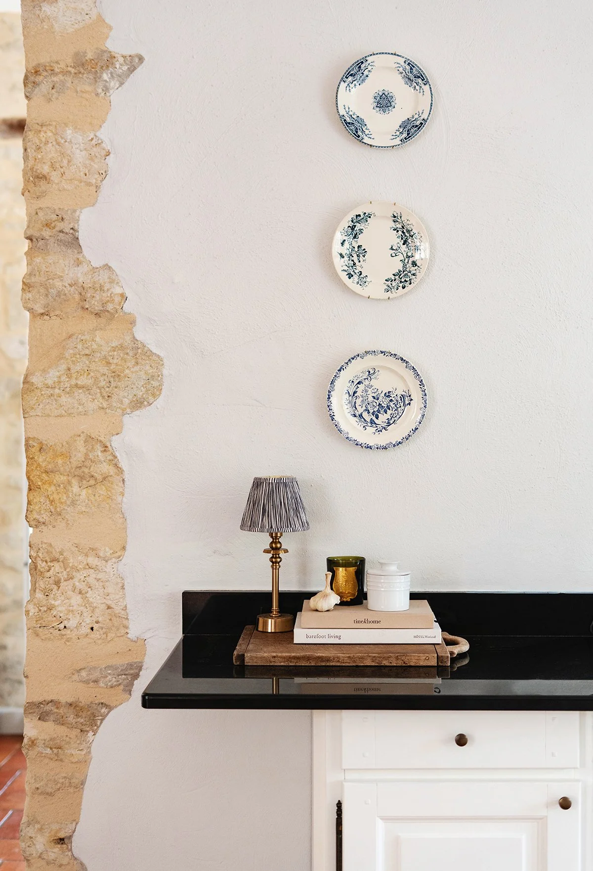
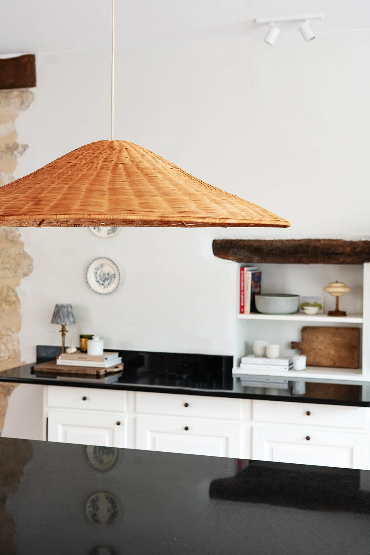
These simple changes have resulted in a kitchen that feels much lighter and brighter with a more contemporary country-kitchen feel. Fundamentally it is the exact same kitchen. By painting the cabinetry a soft off-white, the shiny black granite bench tops feel less circa 1992 (OK, fine, they still look circa 1992 but they look much less offensive against the white scheme). The simple brass drawer and door pulls add a touch of warmth to the scheme and the niche shelving provides a good spot for some kitchen styling. By not changing the layout of the kitchen, I also got to keep the original timber lintels above the niches which adds a nice textural and material element to the otherwise white wall. By adding in two identical glass fronted cabinets, I gained extra storage for all the crockery and glassware and gave myself another spot to add some styling touches.
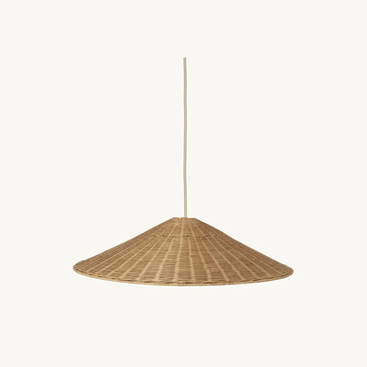
I was restricted on the lighting (as only one light could be wired into the ceiling - everything else had to be ceiling mounted) so I went with a single almost metre-wide rattan pendant that adds a different texture and material to the space (and again, softens the black / white scheme) and is large enough scale-wise to be in proportion with the enormity of the island bench. (I had originally wanted two pendants but this wasn’t possible and now I’m quite happy with the one big pendant - it actually works better visually). I then kept the spot lights consistent with the rest of the house - simple, modern and white.
The end result…? We now have a kitchen that feels homely and finished. Contemporary but also traditional. It really does just feel like an updated version of what was already there and I kind of like that the essence of this room has remained unchanged. One of the areas that I was really grappling with when I was considering the full kitchen renovation was adding in more cabinetry (it would have meant adding in a plaster board wall over the top of the original stone wall and losing the timber lintels above the niches). It felt wrong. I’m so glad I didn’t go with any upper cabinets or full size cabinets for a fridge or pantry and in doing so, lose some of the original elements of the kitchen. What we have now is a kitchen that feels like it belongs to the house - in a style that feels like me.
Do the Above Changes Actually Make a Difference
For us, yes. All of a sudden this year, being in the kitchen felt nice. It felt happy. I know that is daft. But the spaces we inhabit need to feel like us - and they need to function as we need them to. Our kitchen glow up was simple and cost effective but it literally changed the whole feeling of the house. For the first time, it felt like the house was finally finished. And that it was truly ours. And it felt good.
sourcebook
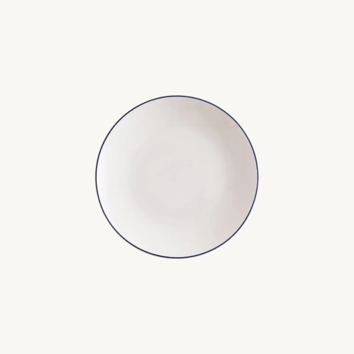
Notes:
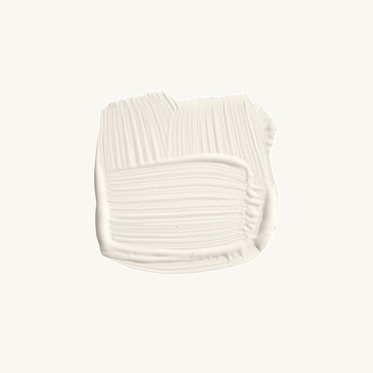
Wall Paint - I used Farrow & Ball Strong White in Modern Emulsion for all the walls in the house and the same colour in Modern Eggshell for all window and door trims. It is a white with a cool grey undertone that feels very fresh and modern.
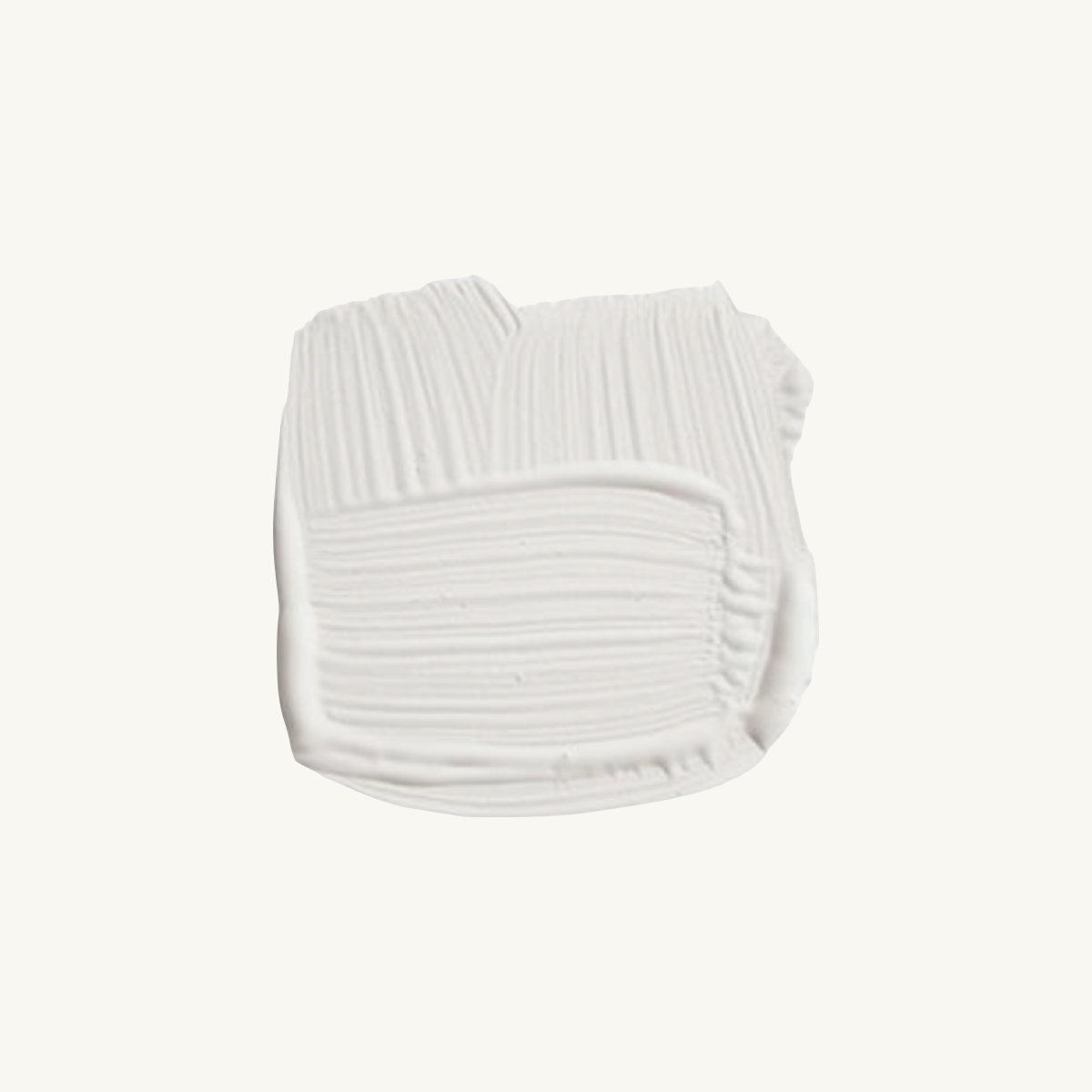
Cabinetry Paint - I used Farrow & Ball Wimborne White in Modern Eggshell for the cabinets. It is a slightly creamier warmer white that Strong White. I chose this slightly warmer white to soften the contrast with the black granite. It makes a difference that is not super obvious in the images. But it overall gives the kitchen a softer look. Less stark black and white and more black and cream.
Freestanding Storage - In my dream scenario I wanted an antique glass cabinet. I tried. I looked. But I don’t live in France and it’s hard to do this kind of vintage shopping from afar. And I was not going to delay anything on this kitchen for some hard-to-come-by antique cabinet. So, I mentally moved on and chose a pair of these Drawer glass cabinets to fill the blank kitchen wall. I couldn’t find a single unit that was wide enough to fit the width of the wall proportionally which is why I chose a pair. When considering proportions and scale, if you can’t get one single item to be big enough on its own, consider doubling up to get the right scale. I was also considering scale and propotion when deciding on the height of the freestanding cabinetry - I didn’t want anything that was too high given there are no tall built in kitchen cabinets and no overhead cabinetry. This mid-height is perfectly proportioned for the ceiling height and the height of the kitchen bench.
Brass Knobs - I originally looked at the beautiful DeVol aged brass knobs but they were more than double the price of these Zara Home ones. Given I needed 24 of them, this small item could have really added up. So I went cost effective and I’m so glad I did. These Zara Home ones are more than decent - sometimes you’ve got to know where to spend and where to pull back.
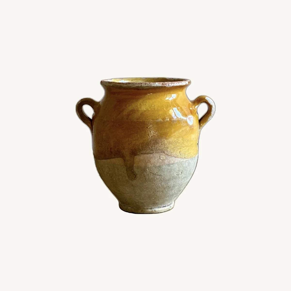
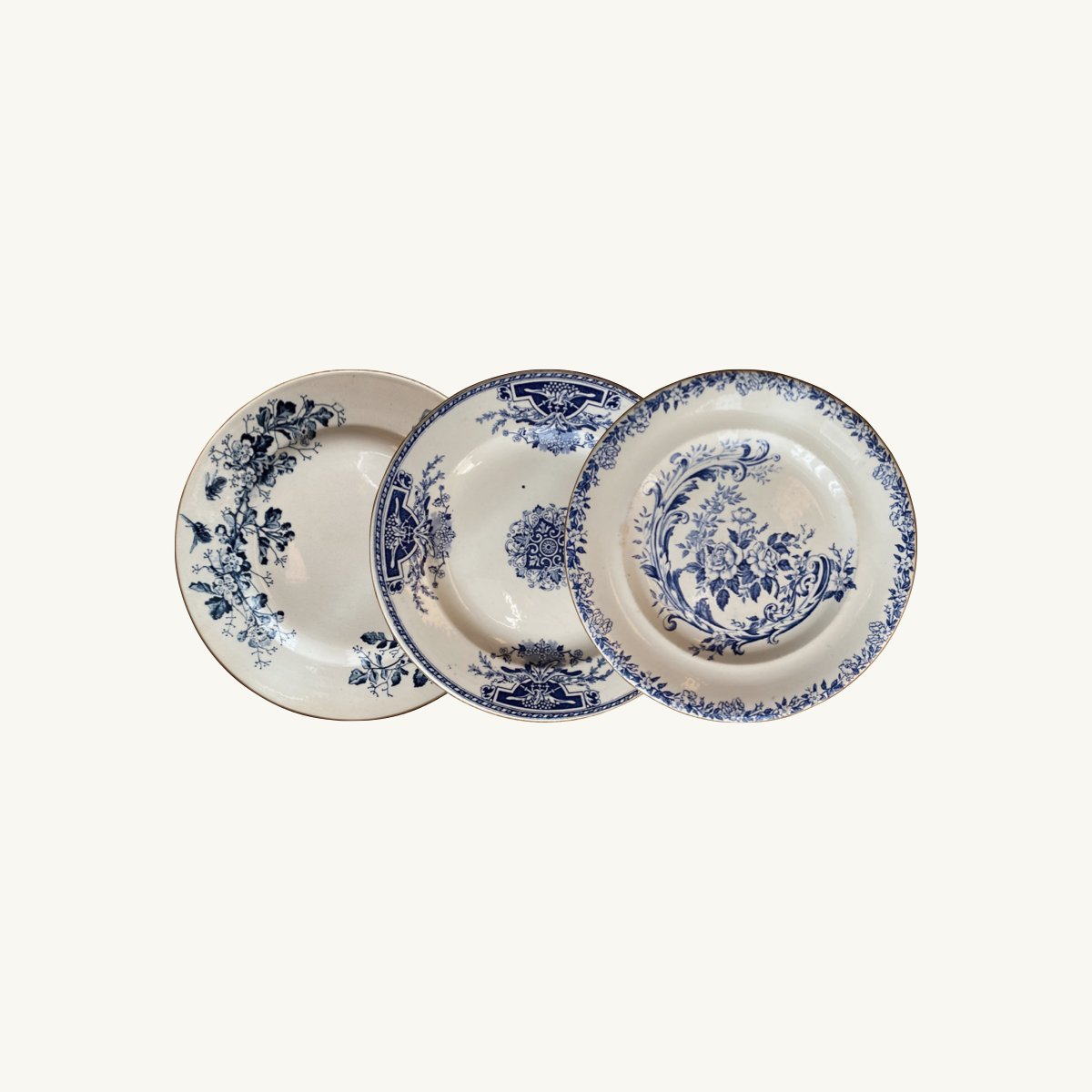
Vintage Items - I source these items when I’m in France but have provided links to similar items online.
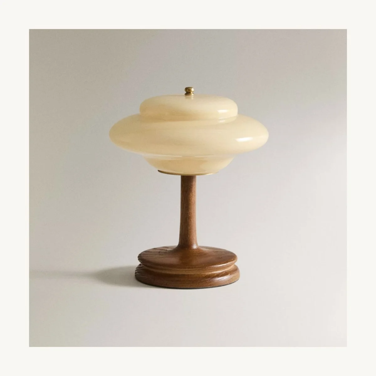
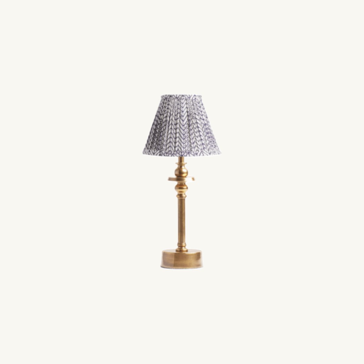
Rechargeable Lamps - a great addition to any kitchen for softening the lighting once you’ve finished prepping a meal. I have a handful of these Pooky ones for using on the outdoor dining table and found this vintage inspired glass one while in Zara Home in Paris. (Side note: Zara Home in Paris is a destination in itself - it is so incredibly beautiful).
more French House renovation articles
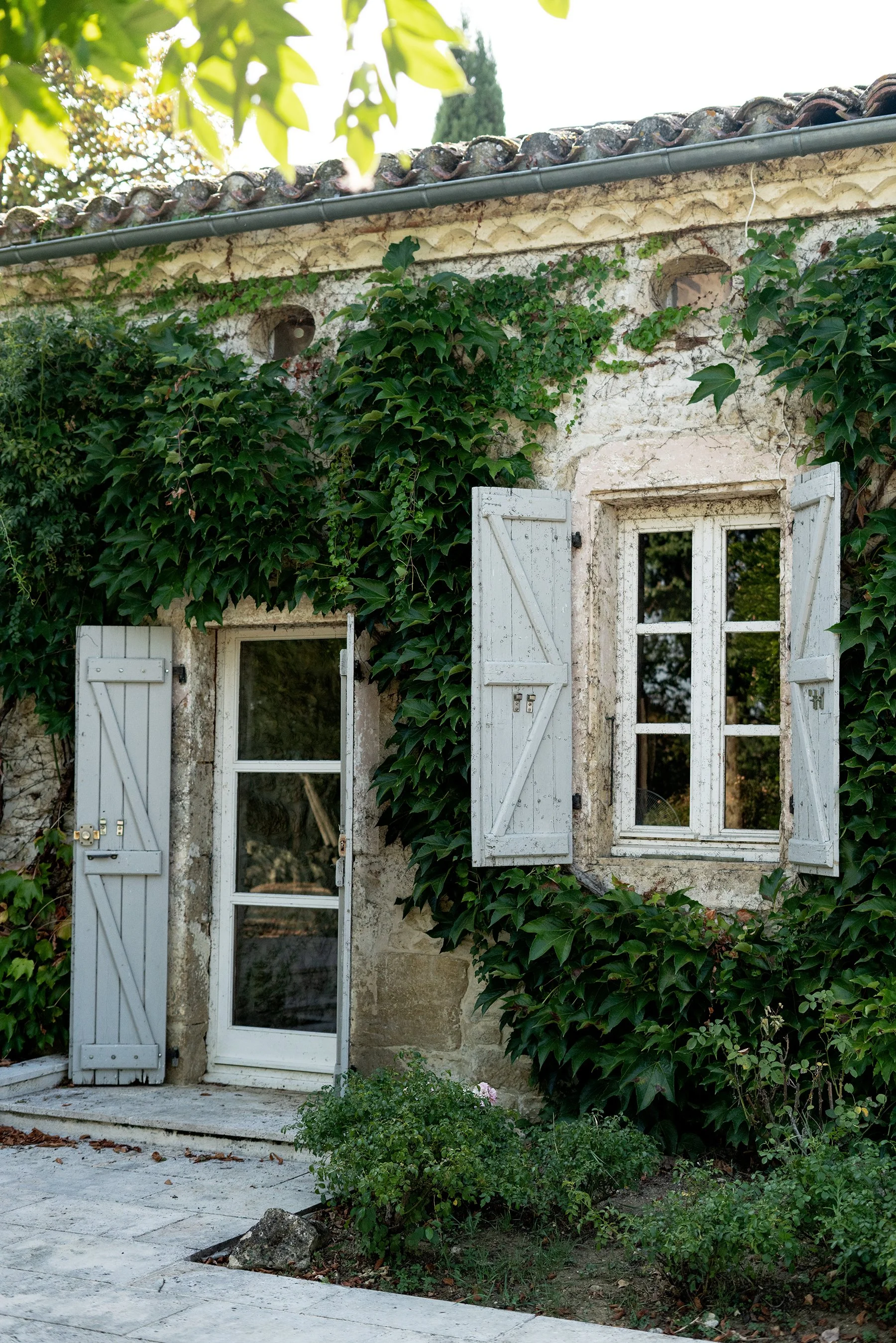
The very start of our journey - from how and why we decided to buy a house in France.
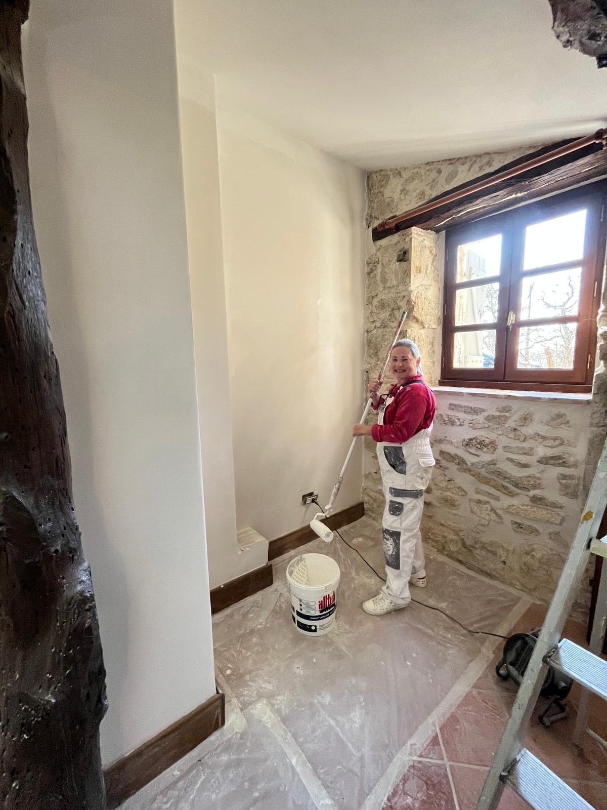
FRENCH HOUSE: THE FIRST CHANGES HAPPEN
The beginning of renovations - painting, plastering, lights and carpet. The foundation for everything else we plan to do.
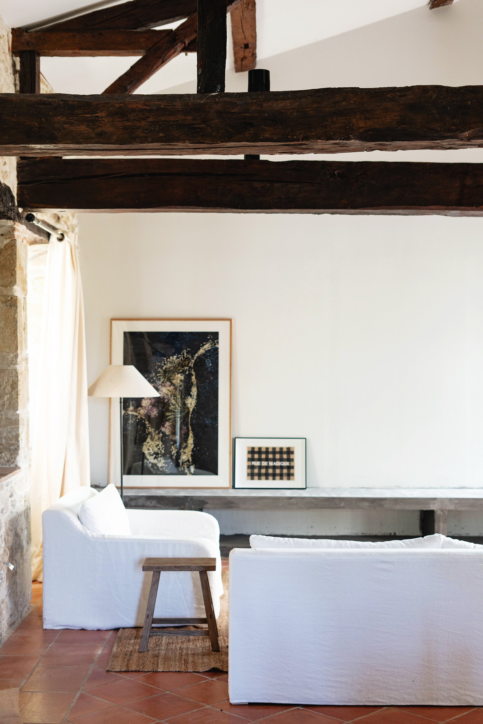
The sejour…everything you may wish to know about this room in the French house. Including a sourcebook.

The final instalment (for now!) on the sejour in the French house. Wood burner is in, plinth has been painted and artwork has been hung
The salon transformation. From a dark chaotic room to one that is light and airy. This has been a tricky room to get right.